This case study is a self-published project. So, this case study is not affiliated with or endorsed by Karnavati University. I have shared the process from start to finish in working on this case study.
Happy reading everyone :D
Overview:
The Karnavati University Student Portal is one of the most vital tools needed by students of the university. It performs various functions ranging from payment of tuition and other fees to registration and view academic’s course details, balloting for hostel accommodation and many more.
Over the year, there have been little or no improvements to the functionality of the dashboard. I realized that the dashboard wasn't meeting my needs as a student. Also, my classmates and other university students were having the same problems.
What made me choose Student Dashboard for a redesign?
Since I began my studies, as a student in the Design program at Karnavati University, I have had problems with the student portals. They don't offer useful features, appear outdated, or match the institution's corporate identity.
WHY: Because the Student Portal's unreliable UI and UX made it challenging for students to utilize. As a student of design, I am aware of what makes a product visually appealing and easy to use. I believed that I could improve the portal by using my abilities.
Design Process:
The Design Thinking technique by Stanford is used in the design process conducted in this case study.
“Design Thinking is a design methodology that provides a solution-based approach to solving problems.”
Observation:
I made observations by trying out the current portals and see where I feel constrained when interacting with portals. After trying them, I noted a few points that could potentially be problems when students use these portals.
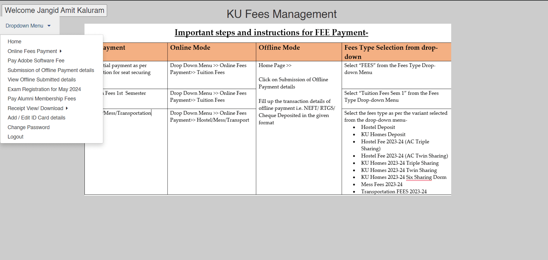
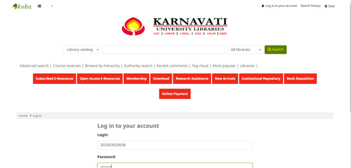
1 - Fees Management System for Fees Payment
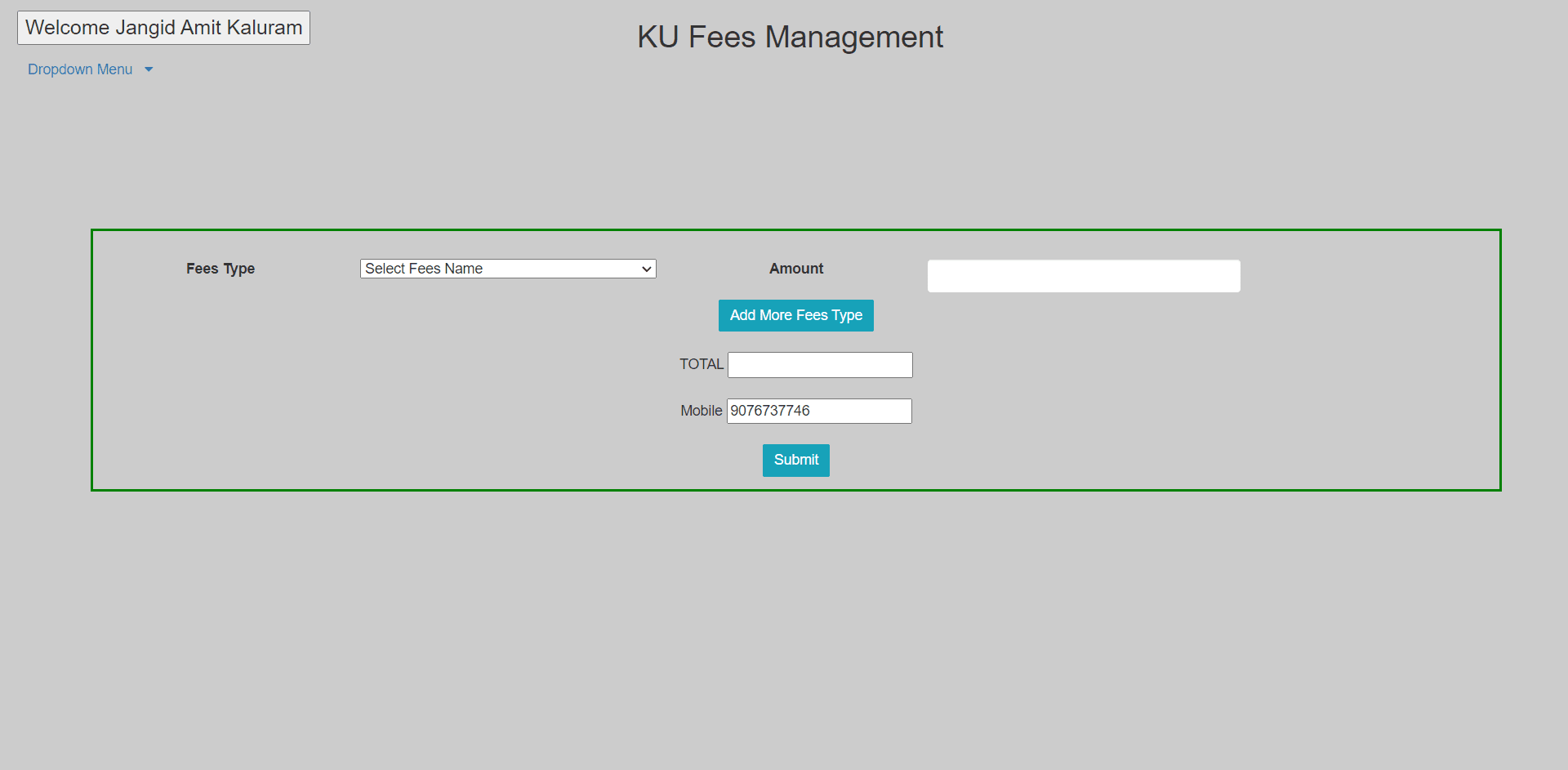
Online tuition fee payment form
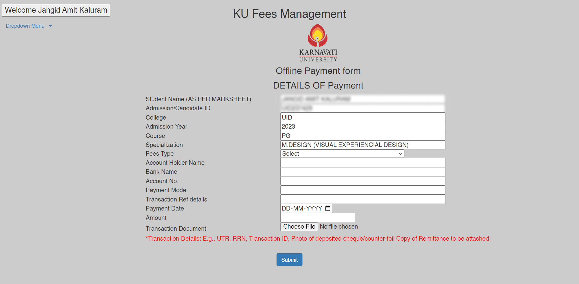
Offline tuition fee payment form
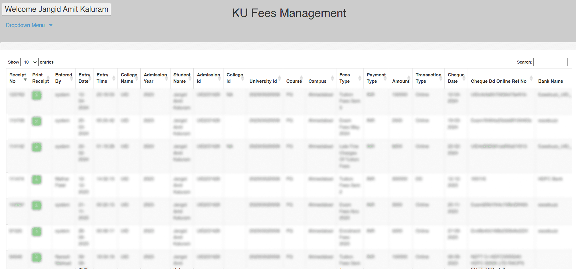
Transaction/Payment history page
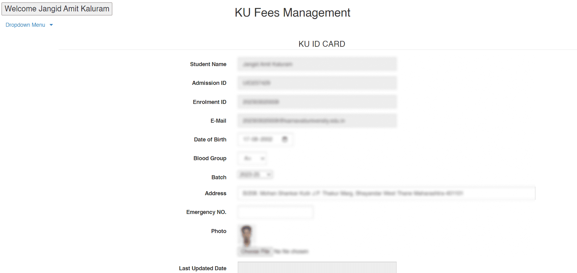
Account/Profile page
Mobile Application for academic details.
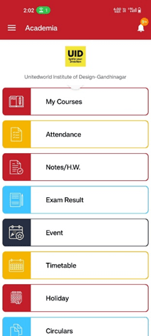
Home screen
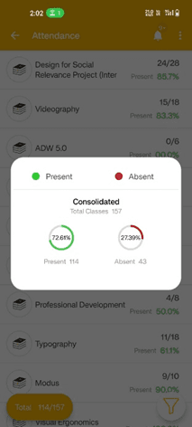
Attendance screen
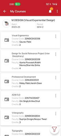
Couses enrolled screen
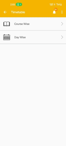
Timetable view option screen
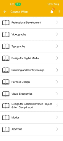
Course wise timetable
Course wise schedule screen
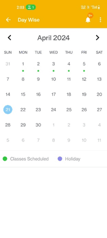
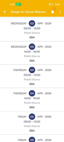
Day wise timetable
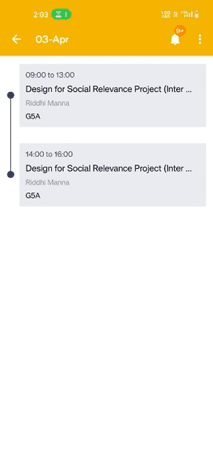
Day wise schedule screen
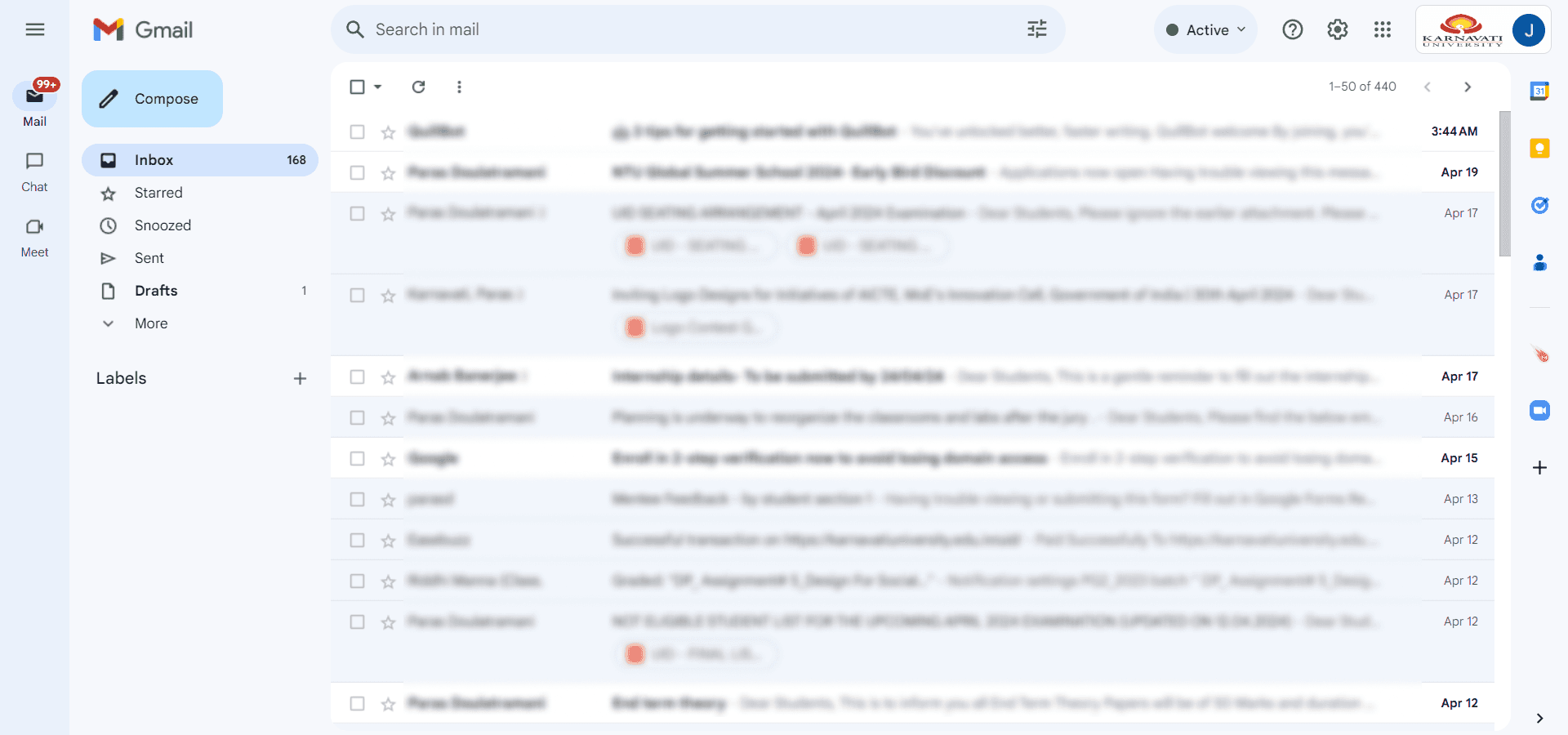
3 - Gmail for important notices and alerts (Individual Google workspace account)
4 - Library management system to mange book issued.
Login page
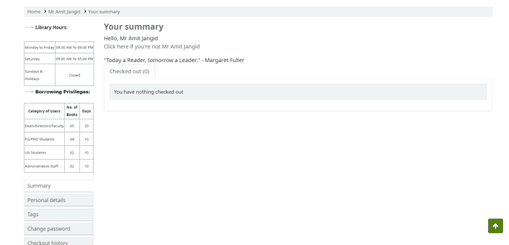
Manage check-ins and check-outs of the issued book
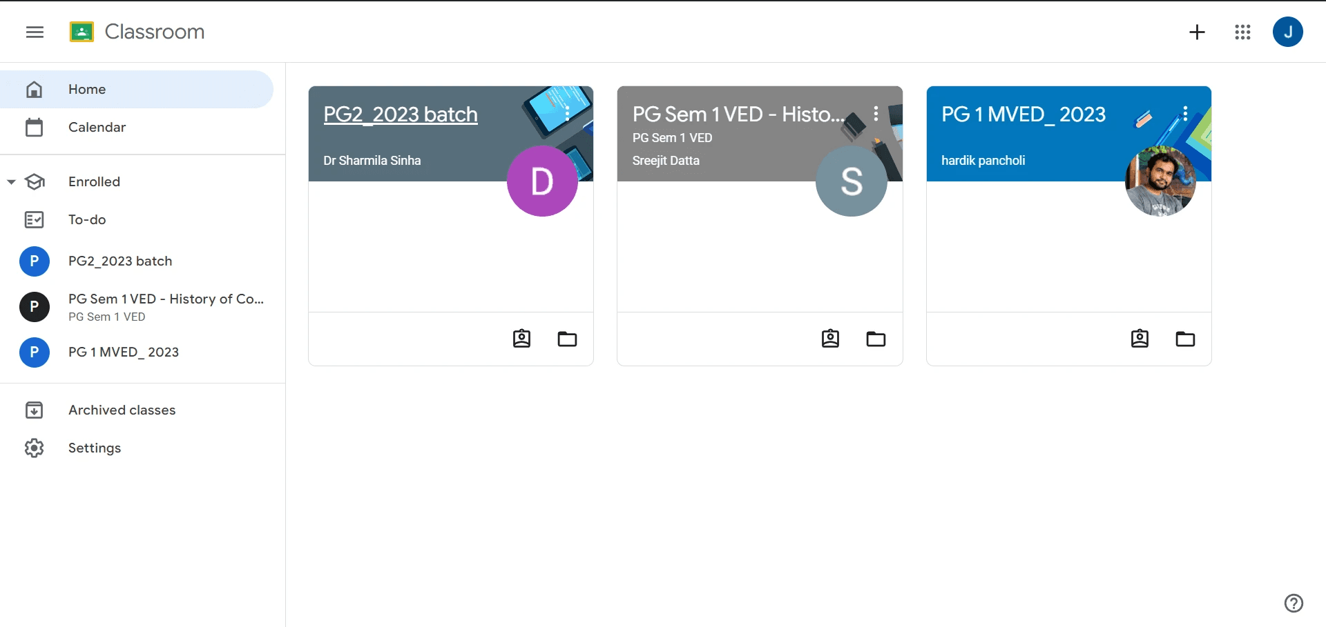
5 - Google Classroom for assignment submission.
Research Plan:
Research Objective: The primary objective of this research is to empathize with students who use the dashboard & portals in order to gain insights about their needs, preferences, and pain points. This understanding will inform the design process to create a more user-centric and effective UI/UX.
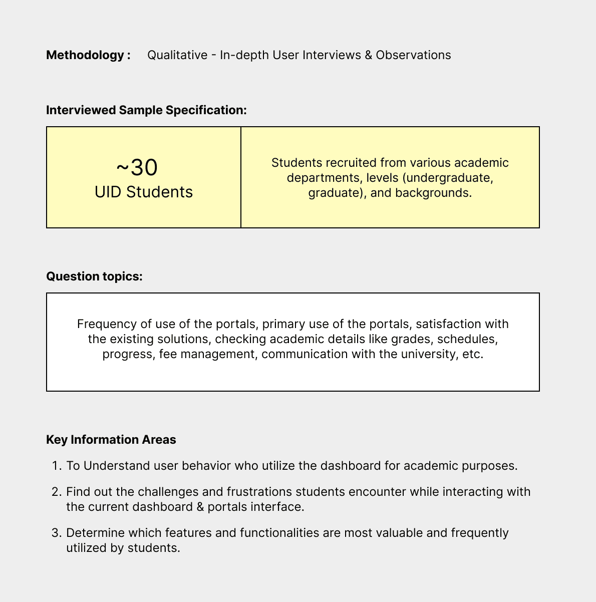
Research Key Findings:
Students disregard most resources that are not on the dashboard.
Lack of important news and alerts.
Some resources on the application are not working.
Over 90% of the students pay their Tuition Fees through Online Payments (Cheques, Demand Draft are rarely used)
Students have difficulty in accessing course materials, assignment deadlines, and exam schedules
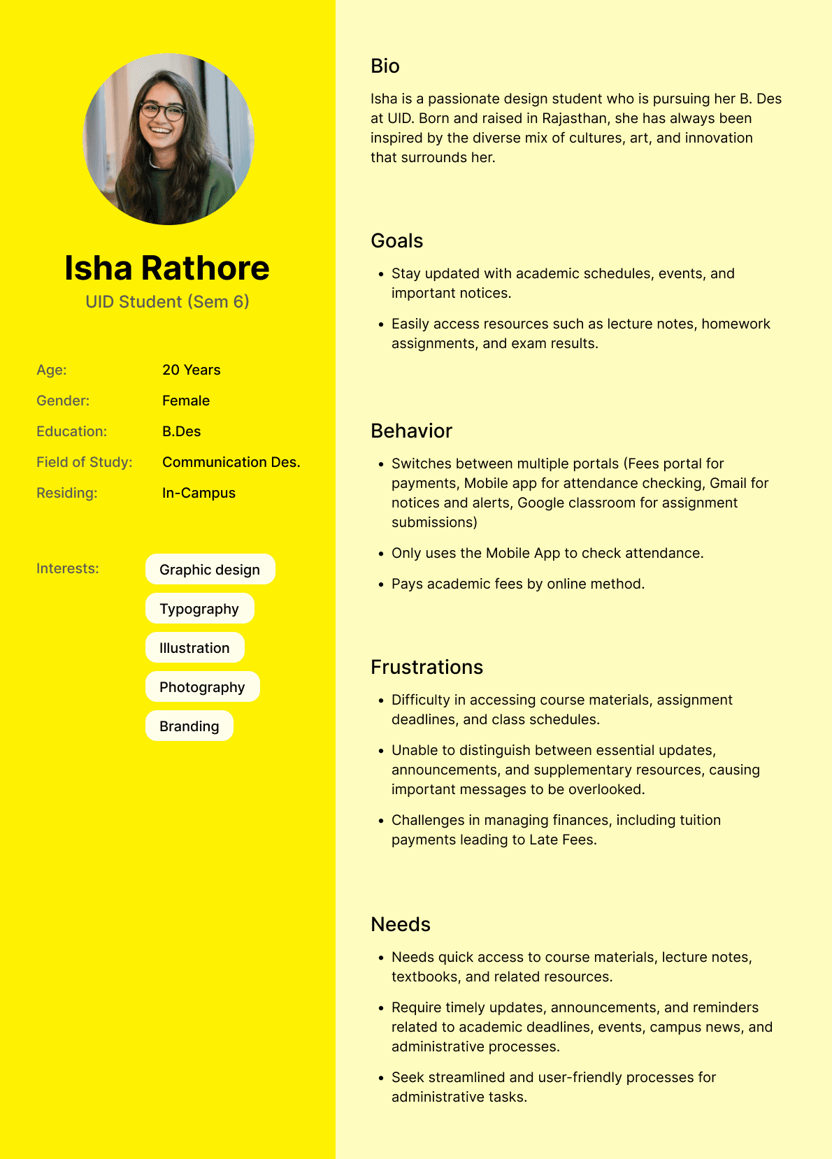
User Persona:
The next step I did was to create a User Persona. I created user personas from ~30 interviews students. User personas are needed to describe potential users based on the research that has been done. The user persona that I’ve created describes user profile and bio, user goals of using the portals, user behavior using the portals, frustration when using the portals, and what the user needs from the portals.
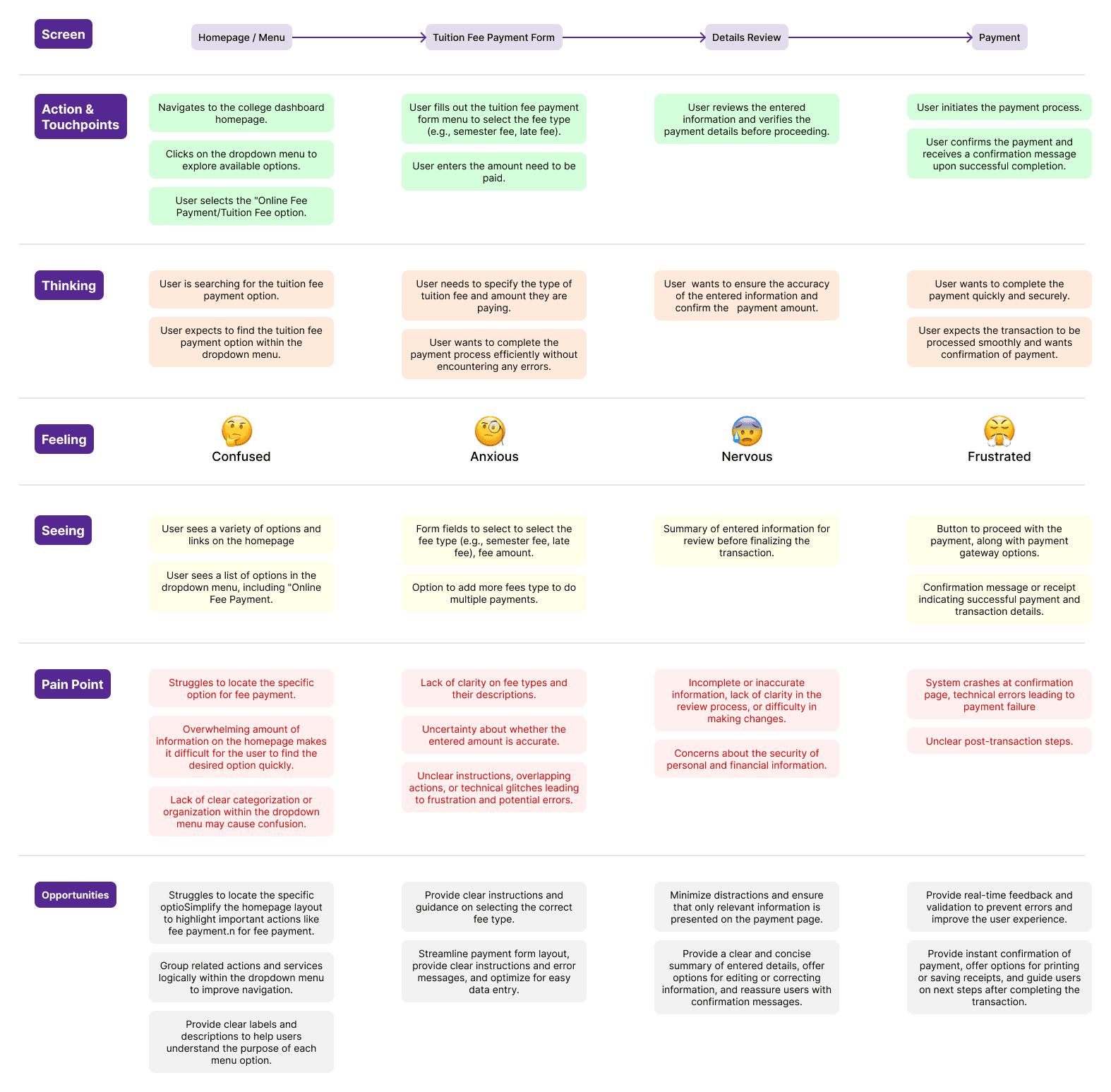
User Journey:
From the user journey map, I can find out how users behave when paying tuition fees on the Fee Portal and what steps they go through. I can also find opportunities based on user pain points that are useful for design improvements.
Identification of Problem:
Based on the results of the analysis of user interviews and the user journey map, some problems faced by students are.
Unable to access academic resources:
Students don’t have easy access to course schedule and materials, lecture notes, textbooks, and supplementary resources relevant to their academic studies.
Lack of important notices and alerts:
Difficulty in distinguishing between essential updates, announcements, and supplementary resources, causing important messages to be overlooked.
Inconvenient Administrative Processes:
Students seek streamlined and user-friendly processes for administrative tasks, such as course assignment submission, fee payments, leave applications, and document submissions.
Technical Issues:
Frustration with technical glitches, slow loading times, or system crashes on the student portals. Difficulty in accessing the portals from different devices or browsers, leading to inconsistencies in user experience.
Communication and Engagement:
Dissatisfaction with the frequency and relevance of communication from the college administration through the portals, leading to disengagement.
Problem Statement:
The student portals has become outdated and students basically use it for only two things: payment of school fees, check attendance. Also, students are not provided with relevant resources that are meant to be used on a daily basis. This results in frustration, inefficiency, and disengagement among students.
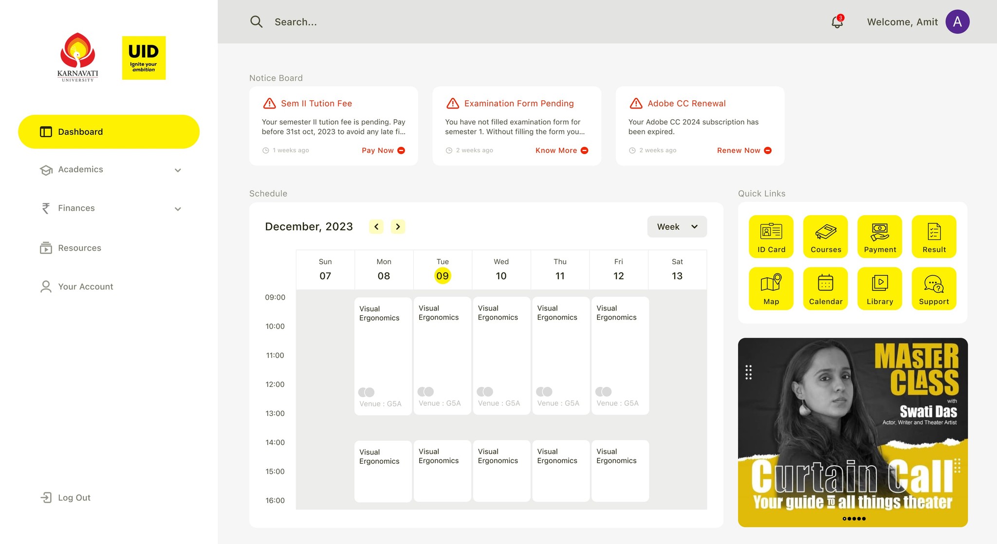
Proposed Solution:
A single dashboard which will serve as a hub for all important information and resources needed by students on a day-to-day basis. To get students to use the portal daily, I introduced new features.
Project Goals:
• Design a single dashboard which will serve as a hub for all important information and resources needed by students on a day-to-day basis.
• Make the dashboard user-centric, functional, visually beautiful, and easy to use.
• Implement some new features and tools to be used by the students for an easier and more reliable flow of important information.
I classified these features into 3 main groups (Academics, Resources, and Finances).
The Challenges:
To redesign the student dashboard and see how far I can push myself to improve my design talent. While redesigning the app I was driven by the motive to make the dashboard visually appealing, and seamless to use. The requirements included doing in-depth research, compiling data on user needs and preferences and enhancing their experiences.
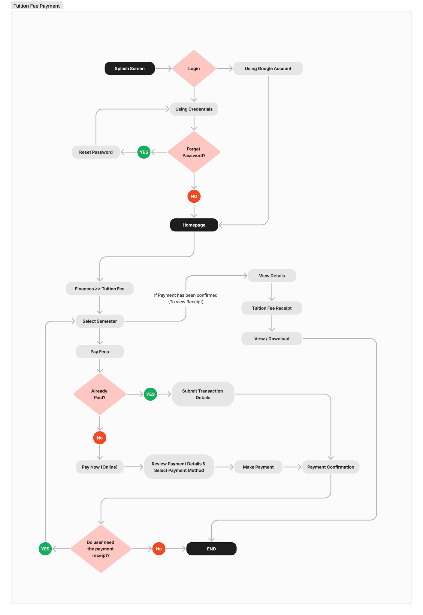
User Flow:
I created a User Flow to describe the steps the users will go through to pay tuition fees on the dashboard and then downloading the receipt generated.
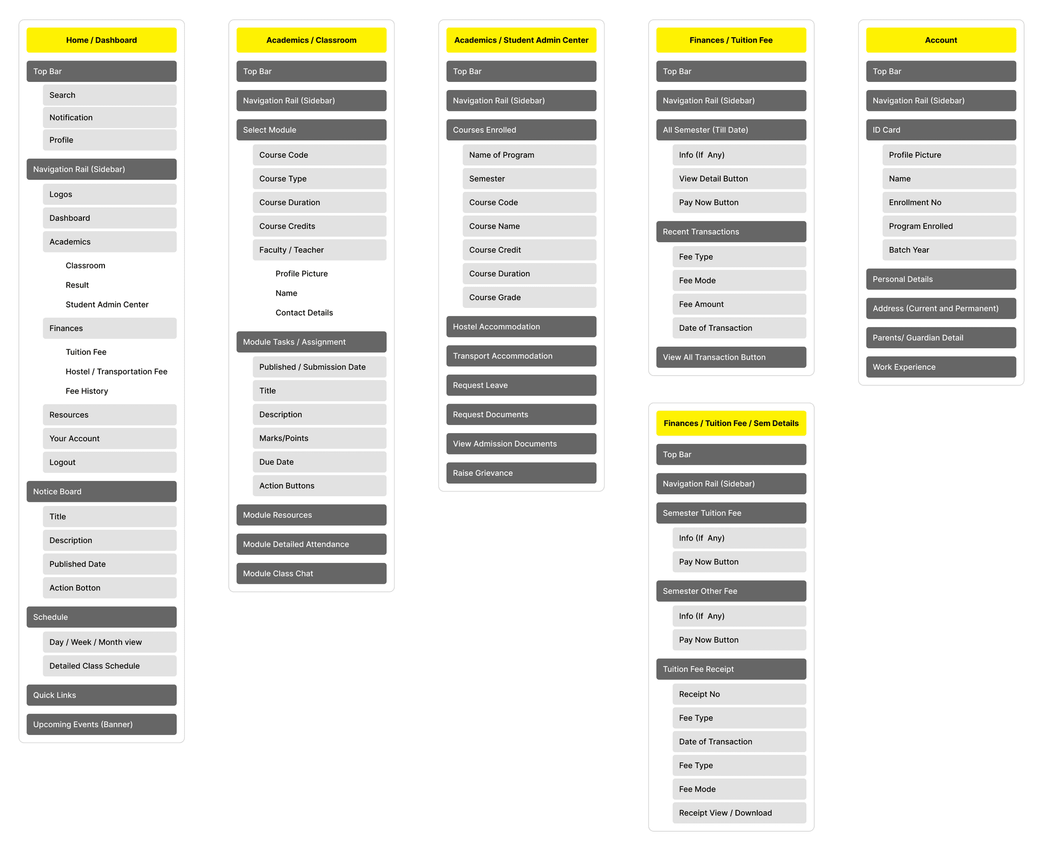
Information Architecture:
To redesign the student dashboard and see how far I can push myself to improve my design talent. While redesigning the app I was driven by the motive to make the dashboard visually appealing, and seamless to use. The requirements included doing in-depth research, compiling data on user needs and preferences and enhancing their experiences.
Wireframe:
I sketched out a few variations for the portal keeping my research in mind and created lo-fi wireframes, based on the information architecture that I’ve created before.
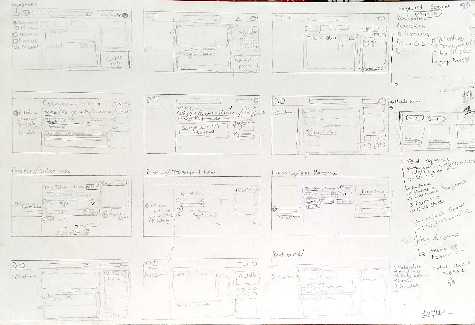
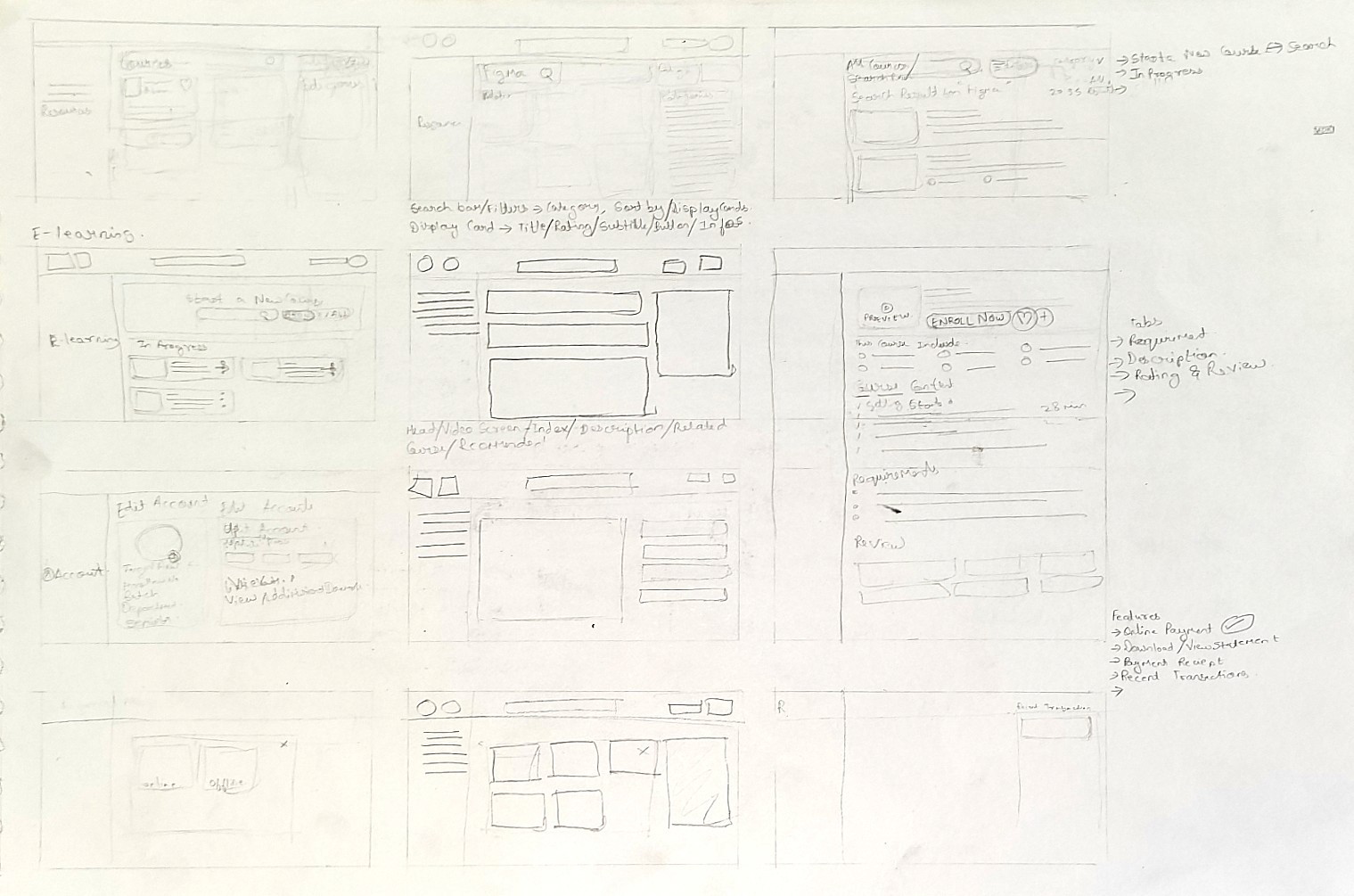
Initial Sketchs
After solidifying the ideas, I took it to the next step by creating Lo-Fi wireframes for pages - Dashboard, Academics, Resources, and Finances
UI Design:
I chose to design the user interface on Artboard Size (Aspect Ratio): 1650px X 900px (Web)
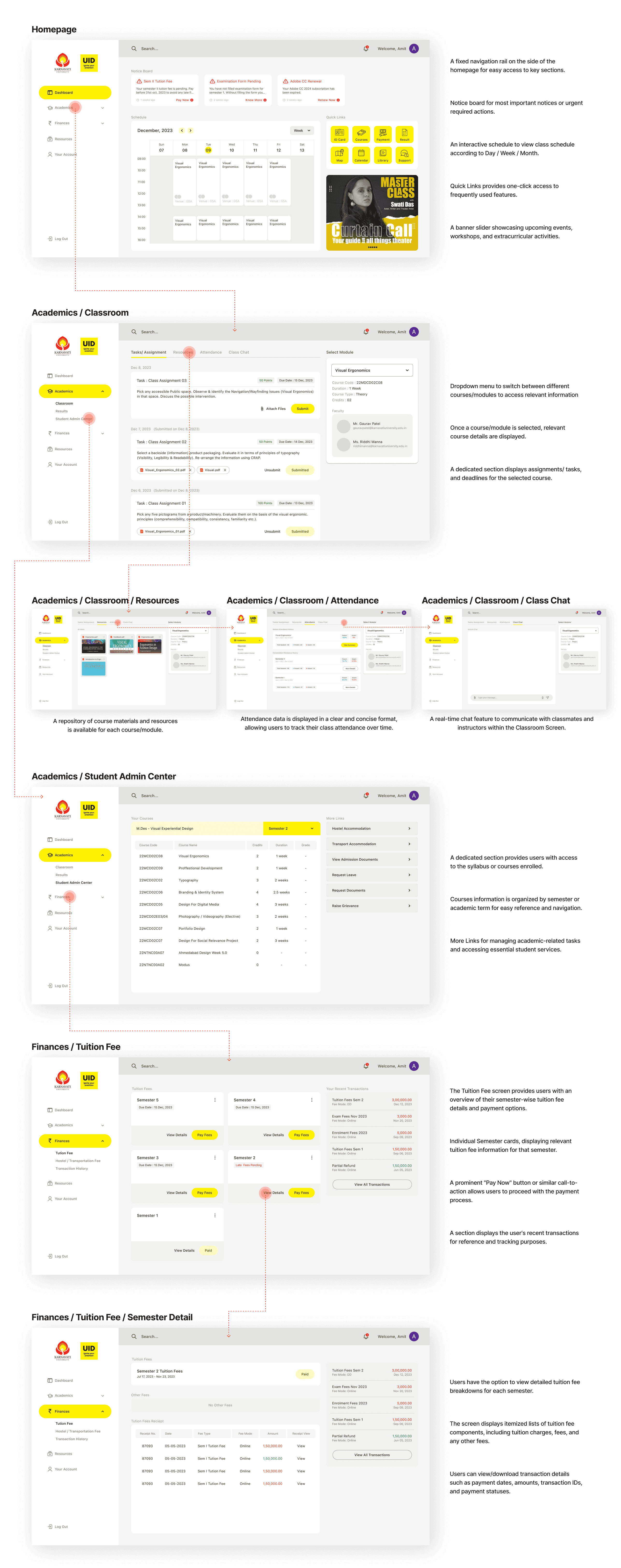
Prototype:
I made the prototype of the Student dashboard new design using Figma. If you want to find an item in this prototype, the journey will be the same as the explanation I discussed earlier. Please click the link below to try the prototype.
Usability Test After Redesign:
After redesigning the dashboard, I re-evaluated the new design that I had created. I tested with users who had participated in the interview giving them some task scenarios. This test is carried out using a Figma prototype, and users are asked to run the prototype according to the task on their device. This test also wanted to see how the user’s expectations of the new design that I created, and find out whether the solution I implemented had addressed all the pain points that users felt with the previous portals.
Navigating to the Tuition Fee Payment Page:
Scenario: Imagine you need to pay your tuition fees for the upcoming semester. Please navigate to the page where you can initiate the tuition fee payment process.
Task: Find the Tuition Fee section and proceed to the payment page.
Checking Course Schedule and Assignments:
Scenario: You have an upcoming assignment deadline and need to check your course schedule for the week. Please find the section where you can view your course schedule and upcoming assignments.
Task: Locate the Schedule section, view your course schedule, and find details about your upcoming assignments.
Viewing Semester 1 Tuition Fee Payment Receipt:
Scenario: You want to download your tuition fee receipt for the 1st semester. Please find the section where you can view detailed tuition fee information for 1st semester.
Task: Navigate to the Tuition Fee section, select the 1st semester, and view the detailed tuition fee information and download/view receipt.
Testing Result :
Users found the redesigned dashboard to be visually appealing and intuitive.
Navigation was generally straightforward, with users able to locate key features and sections easily.
The addition of new features such as the notification section and event banner slider was well-received by users.
Users appreciated the convenience of accessing important information and resources from a centralized platform.
Requests were made for additional sorting and filtering options to organize transaction history more effectively.
Users need step-by-step guidance and tooltips for first-time users navigating the dashboard.
My Learnings:
Take ownership : When I was starting this project, I did not feel confident making decisions, and this led to many reworks that could have been avoided had I been more assured in my design decisions. I was eventually able to become more comfortable making decisions and advocating for what was best for users.
During the project, I conversed with over 30 students from various background. I learnt new things about starting conversations, convincing people to take out a few minutes for the interview, getting helpful insights, making the participants comfortable and much more.
Conclusion:
Summarily, the new student portal design presents a massive upgrade from the existing portal. With the introduction of new features and functionalities and a more user-friendly interface, it addresses the needs of the student population and improves communication within the student community making student life easier.